居中‘魔法’总结
作为一个前端程序员,各种居中的需求会经常遇到,比如说文本居中,水平居中,垂直居中,浮动元素居中等等。掌握一些居中的常用方法也是作为前端攻城师必不可少的技能。
因此总结了几种关于居中的实现方法,可能不是很全面,希望大家共勉,我们只需要掌握自己喜欢的几种便捷的方式,在之后开发的过程中,可以大大提高工作的效率。
该文章不涉及复杂的布局,只是单纯简洁的举例说明居中的问题,具体在项目过程中选择哪种方法主要还要根据实际情况(比如浏览器兼容性,移动端还是PC端等),若有问题欢迎指正,文章围绕以下的布局实现:
HTML部分:
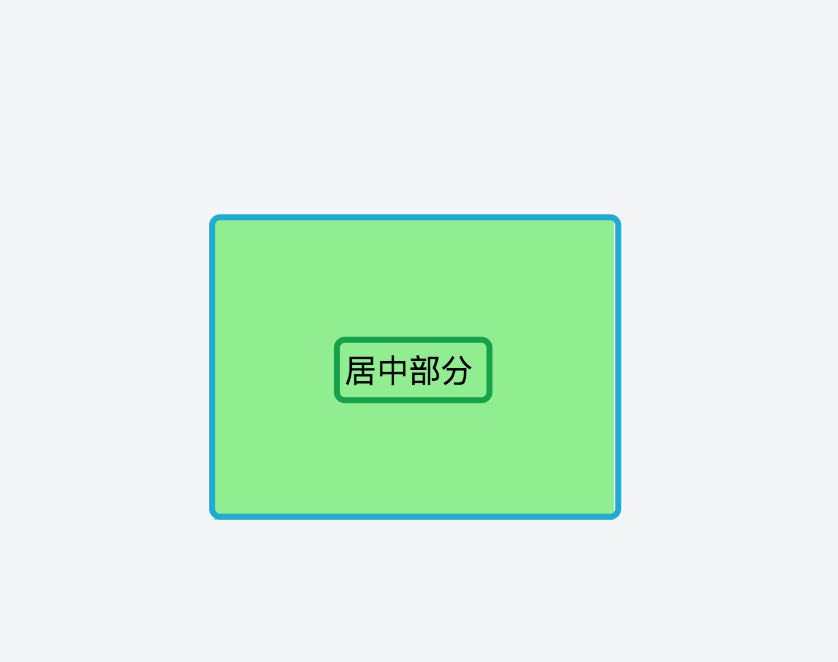
<div class="contain">
    <div class="center">居中部分</div>
</div>
1:已知居中的元素高度,可以支持图片居中
 .contain{
    height:100px;
    width: 200px;
    background-color:red;
    position:relative;
}
.center{
    height: 20px;
    text-align:center;
    overflow:auto;
    margin: auto;
    position: absolute;
    top: 0; left: 0; bottom: 0; right: 0;
    vertical-align:middle;
}
*总结:以上方法比较常用,称为绝对居中;适合对要居中的对象设置高度的情况下,未设置高度时候是失效的;
(1)可以完美支持图片居中;
(2)支持跨浏览器,包括IE8-IE10;
(3)支持高度,宽度百分比%属性值和min-/max-属性;
(4)如果没有使用box-sizing属性时,是否设置padding都可实现居中;
</br>
2:负外边距
 .center {
   width: 300px;
   height: 200px;
   text-align: center;
   position: absolute;
   top: 50%; left: 50%;
   margin-left: -150px;
   margin-top: -100px;
   background-color: lightblue;
}
总结:该方法用于块元素尺寸已知的情况下,比较流行;主要是外边距margin取负数,大小为width/height(不使用box-sizing: border-box时包括padding)的一半,再加上top: 50%; left: 50%;)如果设置了padding值,则margin-left= (width + padding)/2 ,margin-top=(height + padding)/2 ;
IE兼容性好, 但是不能自适应并且不支持百分比尺寸和min-/max-属性设置。
以下均为可变高度的方法:
3:table,table-cell
 .contain {
    display:table;
    height:200px;
    width:200px;
    background-color:red;
}
.center {
    display:table-cell;
    vertical-align:middle;
    text-align:center;
}
*总结:该方法是比较原始的方法,内容块高度会随着实际内容的高度变化,浏览器兼容性也较好;
4:行内块元素 inline-block
.contain{
  margin: 200px 100px;
  position:relative;
  height:150px;
  width:200px;
  background-color:lightgreen;
  text-align:center;
}
 .center{
  display:inline-block;
  vertical-align:middle;
}
.contain:after{
  content: '';
  display:inline-block;
  height: 100%;
  vertical-align:middle;
  background-color:lightgreen;
}
总结:该方法比较复杂,代码量比较多,兼容性较好。关键在于边上设置高100%,宽度为0的伪元素,也可以用一个宽度为0 的行内块元素代替伪元素,
5:transform
 .contain{
   position:relative;
   height:200px;
   width:200px;
   background-color:lightgreen;
 }
 .center {
  position:absolute;
  top:50%;
  left:50%;
  transform:translate(-50%, -50%);
 }
总结:是我比较喜欢的方法,代码量较少,也容易理解,但是不兼容IE8;
6:flex
 .contain {
  display:flex;
  height:200px;
  width:200px;
  background-color:red;
  justify-content: center;
  align-items: center;
}
总结:该方法也比较流行,是CSS3的新属性,代码易于理解,若用于PC开发的话,它不兼容IE8/IE9,不推荐,移动端用的较多;


