产品必读:Kano模型全面介绍(E文超长)
*The Complete Guide to the Kano Model Prioritizing Customer Satisfaction and Delight *
Your feature backlog seems endless — it has contributions from your team, internal stakeholders, customers, prospects and anyone with say on the product (yes, even yourself.)
You cannot build everything right now like everyone’s demanding. You don’t want to put everything in (and [you shouldn’t](file:///var/folders/s3/_zj6yz353g5862dtcsdxhzn80000gn/T/com.soulmen.ulysses3/94afabefd77544e48a909f77fa1b393d/The%20Complete%20Guide%20to%20the%20Kano%20Model/www.uie.com/articles/experience_rot/).) You may have very good hunches of what works and what doesn’t, but you want data to support your decisions, either to be certain yourself or to present to the rest of the organization.
You want to create a product roadmap with the right features. There are many different reasons you might need to include a given feature, but what do you do if you want to know which ones will make your (future) customers happy and prefer it over others?
Creating products that satisfy our customers is a very common topic in UX Design and Product Management circles. This is natural; it is after all, the end goal of our jobs. But…
- How do we measure satisfaction?
- How do we choose what to build in order to provide it?
- How do we go beyond satisfaction and into delight?
These questions don’t have easy answers, but thankfully there’s a very useful tool to help guide us through them. It’s called the Kano Model.
I’ve gone through every online resource I could find (and even some scientific research) to create this step-by-step, in-depth guide with everything you need to understand, use and get started today with the Kano Model.
So, What is the Kano Model?
[Noriaki Kano](file:///var/folders/s3/_zj6yz353g5862dtcsdxhzn80000gn/T/com.soulmen.ulysses3/94afabefd77544e48a909f77fa1b393d/The%20Complete%20Guide%20to%20the%20Kano%20Model/en.wikipedia.org/wiki/Noriaki_Kano), a Japanese researcher and consultant published a paper in 1984[[1]](file:///var/folders/s3/_zj6yz353g5862dtcsdxhzn80000gn/T/com.soulmen.ulysses3/94afabefd77544e48a909f77fa1b393d/The%20Complete%20Guide%20to%20the%20Kano%20Model/index.html#fn1) with a set of ideas and techniques that help us determine our customers’ (and prospects’) satisfaction with product features. These ideas are commonly called the Kano Model and are based upon the following premises:
- Customers’ Satisfaction with our product’s features depends on the level of Functionality that is provided (how much or how well they’re implemented);
- Features can be classified into four categories;
- You can determine how customers feel about a feature through a questionnaire.
Let’s go over each of them.
Satisfaction vs Functionality
It all starts with our goal: Satisfaction. Kano proposes a dimension that goes from total satisfaction (also called Delight and Excitement) to total dissatisfaction (or Frustration).
 SatisfactionDimension
In the image above, the dimension is annotated with different satisfaction levels. It’s important to note that this is not (always) a linear scale, as we’ll see in a second.
You might think that you’d always want to be at the top of that scale, right? Well, it’s not possible.
That’s where the next dimension comes in: Functionality. Also called Investment, Sophistication or Implementation, it represents how much of a given feature the customer gets. It’s how well we’ve implemented or how much we’ve invested in its development.
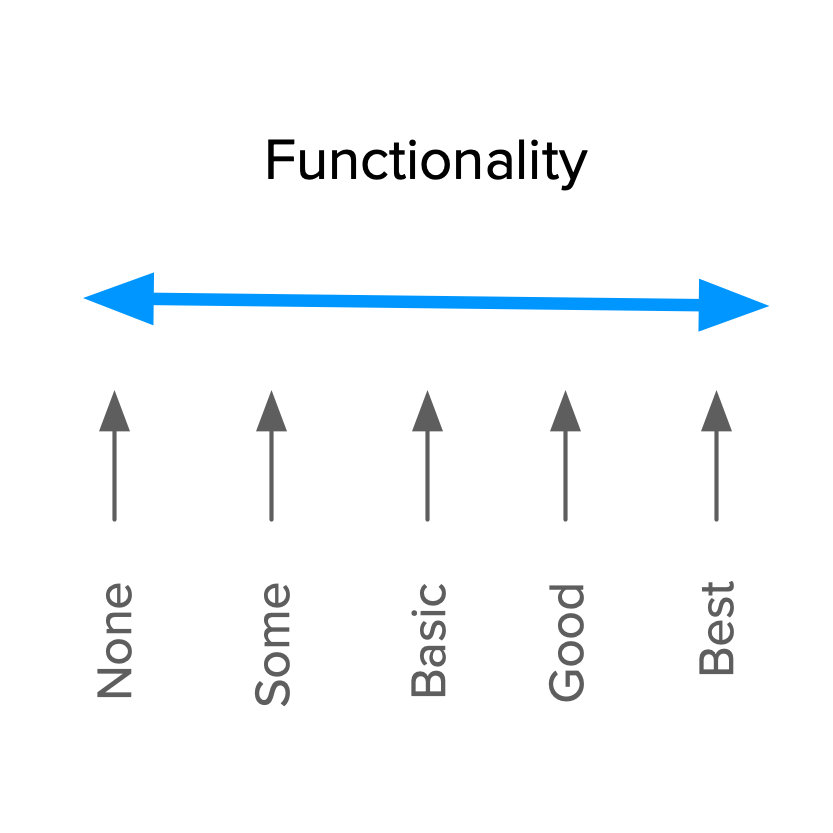 FunctionalityDimension
This dimension goes from no functionality at all, to the best possible implementation. That’s why the term Investment is also very good for this concept. It is clear in reminding us of the cost of doing or not doing something.
Naming aside, what’s really important is to know that these two dimensions put together are the basis of the Kano Model and determine how our customers feel about our product’s features, as we’ll see in the next section.
The Four Categories of Features
Kano classifies features into four categories, depending on how customers react to the level of Functionality that is provided.
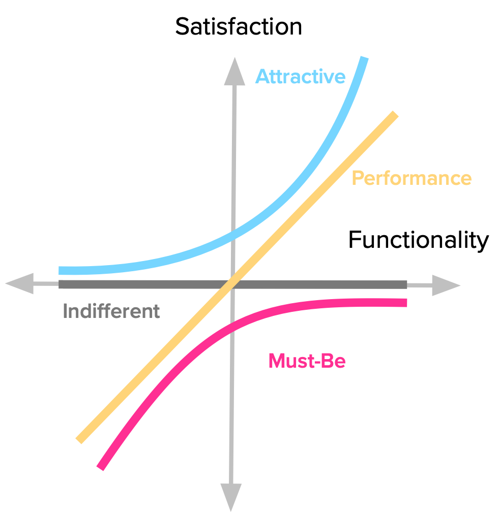 FullKanoModel
Performance
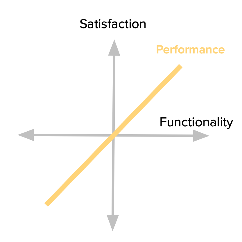
Some product features behave as what we might intuitively think that Satisfaction works: the more we provide, the more satisfied our customers will be. Because of this proportional relation between Functionality and Satisfaction, these features are usually called Linear, Performance or One-Dimensional attributes in the Kano literature (I prefer the Performance name myself).
When you’re buying a car, its gas mileage is usually a Performance attribute. Other examples might be your internet connection speed; laptop battery life; or the storage space in your Dropbox account. The more you have of each of those, the more satisfied you are.
 PerformanceAttributes
Going back to the graphic representation for the model, here we see the behavior of customers’s reaction to this type of feature. Every bit of increase we have in functionality, leads to increased satisfaction. It’s also important to keep in mind that the more functionality we add, the bigger the investment we have to make there (e.g. the team to build it, the required resources, etc.)
Must-be
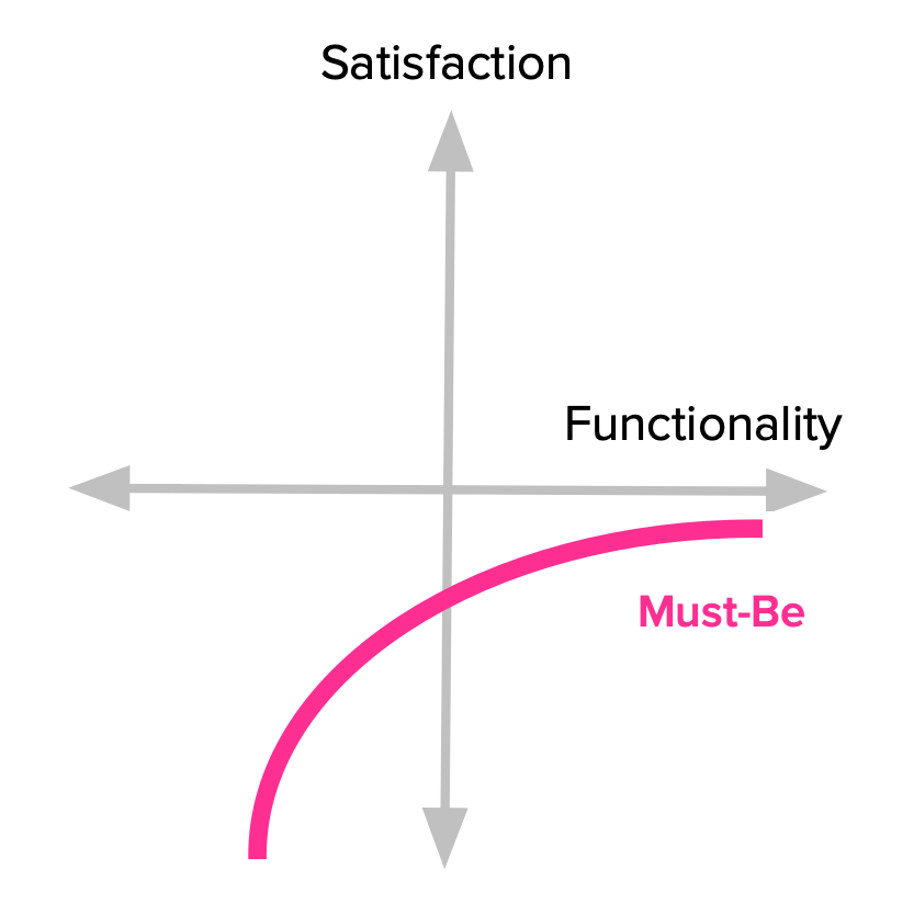
Other product features are simply expected by our customers. If our product doesn’t have them, it will be considered to be incomplete or just plain bad. This type of features is usually called *Must-be or Basic Expectations. *
Here’s the deal with these features: we need to have them, but that won’t make our customers more satisfied. They just won’t be dissatisfied.
We expect our phones to be able to make calls. Our hotel room should have running water and a bed. The car should have brakes. Having any of these won’t make us happy, but not having them will definitely make us angry towards the product or service.
 MustBeAttributes
Notice how the satisfaction curve behaves. Even a little bit of investment goes a long way in increasing satisfaction. But also notice how satisfaction never even reaches the positive side of the dimension. This means that no matter what we invest in the feature, we won’t ever make our customers more satisfied with the product. The good news here is that once you reach a basic level of expectations, you don’t have to keep investing in it.
Attractive
There are features that we don’t expect but when presented with them, our reaction is always positive. These are usually called Attractive, Exciters or Delighters. I tend to prefer the term Attractive, because it properly conveys the notion that we’re talking about a scale. We can have reactions ranging from mild attractiveness to absolute delight, and still have everything fit under the “Attractive” name.
The first time we used an iPhone, we were not expecting such a fluid touchscreen interface, and it blew us away. Think of the first time you used Google Maps or Google Docs. You know, that feeling you get when experiencing something beyond what you know and expect from similar products.
Just remember that our brains don’t have to explode for something to fall under this category. It might just be anything that makes you go: “Hey, that’s nice!”.
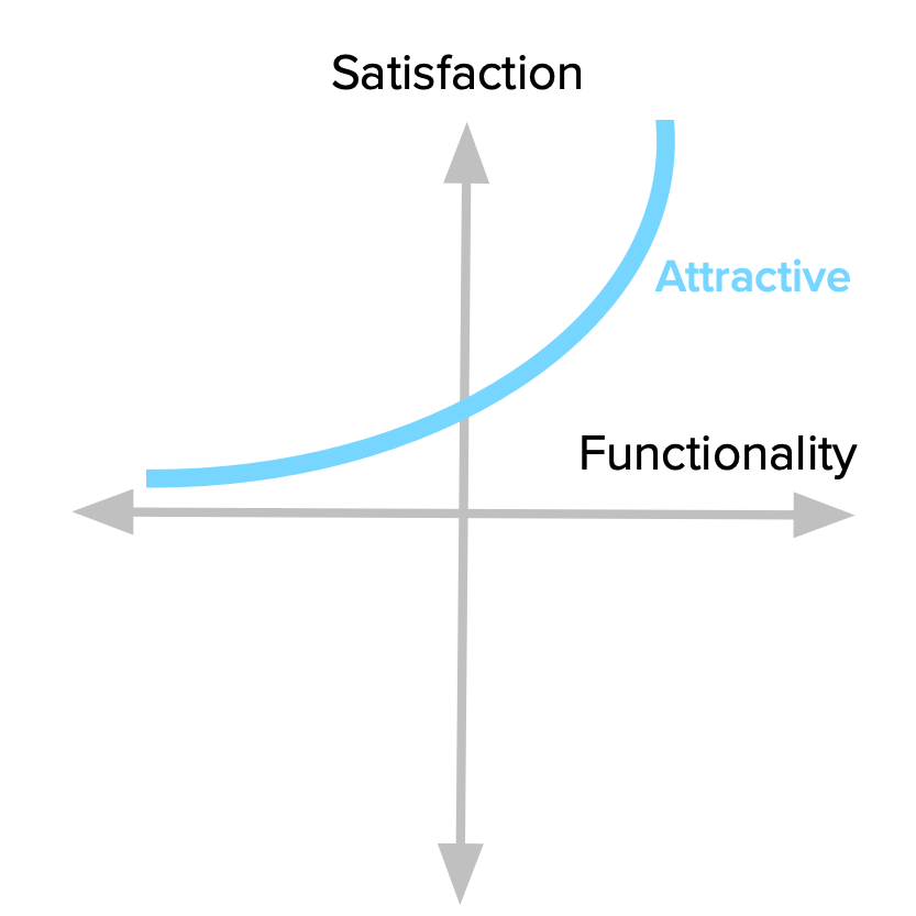 AttractiveAttributes
This is best explained graphically. Look how even just some level of Functionality leads to increased Satisfaction, and how quickly it rises. This fact is also key to keep a check on the investment we make on a given feature. Beyond a certain point, we’re just over-killing it.
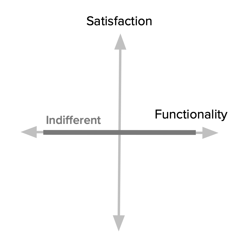
Indifferent
Naturally, there are also features towards which we feel indifferent. Those where having them or not, doesn’t make a real difference to how we react to the product.
 IndifferentAttributes
These features fall along the middle of the Satisfaction dimension (where the horizontal axis intersects it.) That means it doesn’t matter how much effort we put into them, our users won’t really care. This is another way of saying that we should really avoid working on these because they’re essentially money sinks.
The Natural Decay of Delight
Now that we have a full picture of all the Kano categories of features, it’s important to take note of a very important fact: they are not static — they change over time.
What our customers feel about some product attribute now is not what they’ll feel in the future. Attractive features turn into Performance and Must-be features as time goes by.
 SatisfactionDecay
Consider the iPhone example again; the sort of fluid touchscreen interaction that wowed us in 2007 by now is just a basic expectation.
Go back to every memory of amazement you’ve experienced with past products. How would you feel now if the same product was presented to you? If enough time has passed, it’s very likely that you’ll consider that once magicfeature as a Performance or Must-be attribute.
This is due to many different factors, including technological evolution and the emergence of competitors all vying to bring the same functionality after the first mover.
The takeaway here is that any analysis we do at a given point in time is just a photograph reflecting that moment’s reality. The farther we get from that point, the less relevant it will be. Unlike diamonds, Kano categories are not forever.
The Question Pair that Uncovers Customer Perceptions
We’ve now covered the first two parts of the Kano model: the dimensions of analysis and their interplay to define categories of features.
In order to uncover our customer’s perceptions towards our product’s attributes, we need to use the Kano questionnaire. It consists of a pair of questions for each feature we want to evaluate:
- One asks our customers how they feel if they have the feature;
- And the other asks how they feel if they did not have the feature.
That’s why the first question is called the functional form and the second one is the dysfunctional form (they’re also called positive and negative by Jan Moorman). These are not open-ended questions, though. There are very specific options we should use. To each “how do you feel if you had / did not have this feature”, the possible answers are:
- I like it
- I expect it
- I am neutral
- I can tolerate it
- I dislike it
There are some things to consider when wording these options, and we’ll get to those later.
After asking our customers (or prospects) these two questions and getting their answers, we are now able to categorize each feature.
Evaluation table
One of the great things about the Kano model is that it accounts for both having and not having some functionality. This shows us the extent to which something is really wanted, needed or indifferent for our customers.
We do this through an evaluation table that combines the functional and dysfunctional answers in its rows and columns (respectively) to get to one of the Kano categories we described. Every answer pair leads to one of those categories and a couple more that come from using this question format.
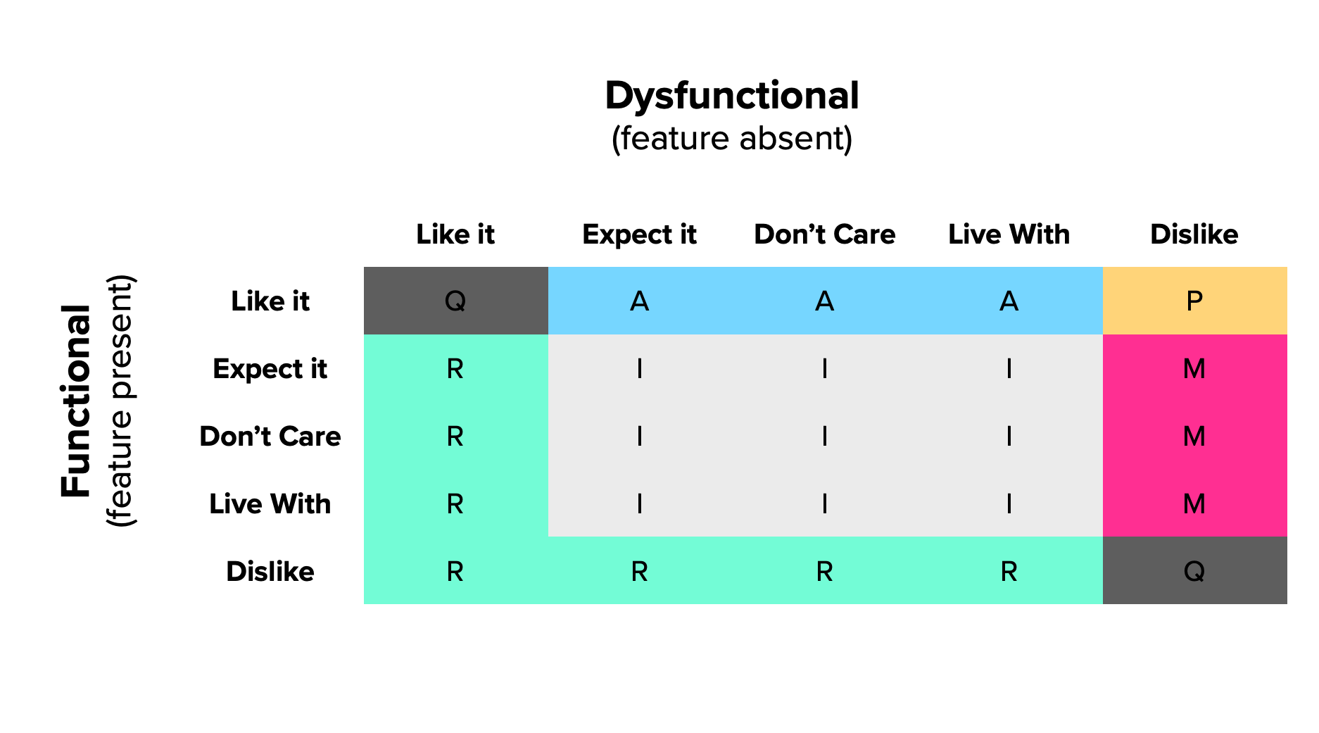 EvalTable-Std
Two new categories
Given the fact that we’re asking from both sides of the same thing, we’ll be able to tell if:
- Someone has not understood our questions or the feature we’re describing;
- What we propose is actually the opposite of what they want.
These categories are not actual Kano categories; they’re just artifacts of the questionnaire (but are also useful).
If someone says she “dislikes” the functional version and “likes” the dysfunctional version, this person is clearly not interested in what we’re offering, and perhaps actually wants the opposite. This new category is called Reverse. If a majority of customers are telling you some feature is a Reverse, you can just switch the Functional and Dysfunctional questions and rescore their answers as if you had asked the questions in that order.
When you get conflicting responses (such as “Like” and “Like”) to both questions, it’s called a Questionable answer. For this very reason, Fred Pouliot[[2]](file:///var/folders/s3/_zj6yz353g5862dtcsdxhzn80000gn/T/com.soulmen.ulysses3/94afabefd77544e48a909f77fa1b393d/The%20Complete%20Guide%20to%20the%20Kano%20Model/index.html#fn2) suggested that cells (2,2) and (4,4) from the standard Kano evaluation table be changed to also be Questionable. Some of these are to be expected in your results, but if you get a majority of users with Questionable answers, then there’s probably something wrong with what you’re asking.
A (slightly) revised evaluation table
From now on, we’ll be using Pouliot’s slightly revised table to classify our answers.
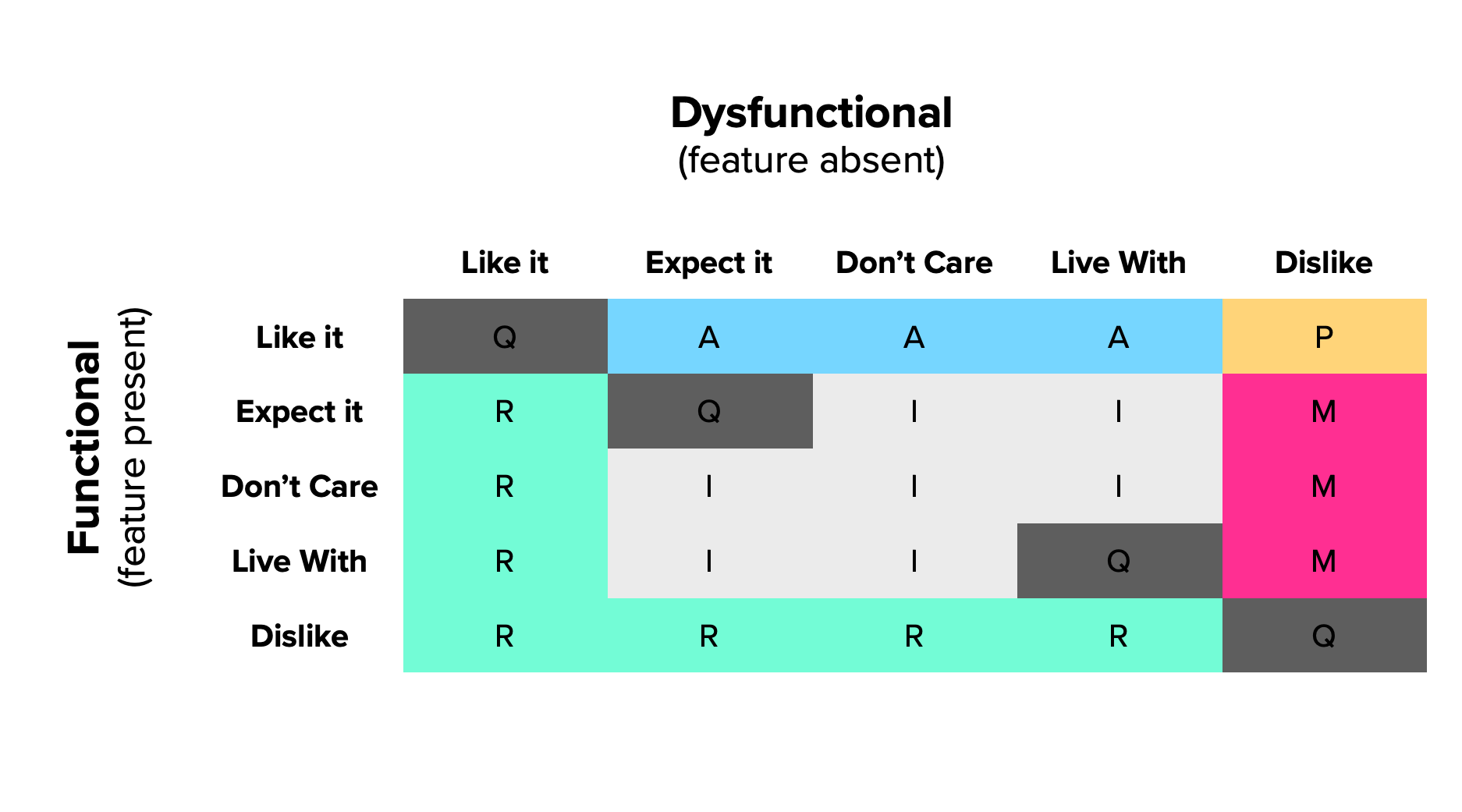 EvalTable-Mod
We should try to internalize how each category is derived from a pair of responses so we better understand the model and don’t need to reference the table every time.
We’ve already covered where Questionable answers (contradictory response pairs); they form a diagonal through the evaluation table, except for the middle cell.
Performance features are the most easy to position. They are the ones where customers like having them and dislike not having them. This extreme reaction translates the linear “more is better” relation between these two dimensions.
Must-be features are the remaining situations when a customer dislikes not having them. Customers go from tolerating to expecting to have the feature
Attractive features are found when a customer likes having a feature that is not expected. This is another way of saying that what we’re proposing is both new and attractive.
Then, we have Indifferent features. These occur for any “I’m neutral” or “I can tolerate it” answer, for either the Functional or Dysfunctional questions. That is, they occupy the middle cells of the table (discounting any of the previously described categories).
Finally, we have Reverse answers positioned along two axes where reactions are either to like not having the feature or to dislike having it. You can see which category they’re the reversal of by flipping the Functional / Dysfunctional values. You can then know if it is a Reverse Performance, Attractive or Must-be feature.
Using the Kano Model
Now that we have a basic understanding of how the Kano model works, it’s time to go over what it means to use it with multiple users and features.
Our goal as Product Managers and UX Designers is to determine which features lead to more satisfied customers and use that information to help us prioritize what we need to build. There are important details to consider in order to get there.
This section is based upon multiple accounts of Kano model usage by practitioners and researchers that have shared their experiences and lessons learned, at each step of the process:
- Choosing features and users for analysis;
- Getting the (best possible) data from customers;
- Analyzing the results.
Step 1: Choose your target features and users
The first thing to consider is the scope of your analysis — both in terms of features and users.
Choosing features
The features you choose to study should be those where the user will get any sort of meaningful benefit out of them. Your backlog may contain a number of different kinds of items you may need to include such as technical debt payment, something for the sales or marketing teams, a reporting system, or a design refresh. All of these are out of scope of the Kano analysis.
We’re measuring customer satisfaction among externally tangible features, but products are way more than that. If you need data to support not doing something an internal stakeholder is asking of you, you’ll be doing a disservice to your team, your customers and yourself if you use a Kano study for that.
Also try to limit the amount of features you include in your survey, specially if you’re doing the study with volunteer participants. This should improve your participation levels and your subjects’ available attention.
Selecting customers
When selecting customers (or prospects) to participate in your study, you must consider some demographic, logical cohort or persona to which they belong. Otherwise, your data will most likely be all over the map [[3]](file:///var/folders/s3/_zj6yz353g5862dtcsdxhzn80000gn/T/com.soulmen.ulysses3/94afabefd77544e48a909f77fa1b393d/The%20Complete%20Guide%20to%20the%20Kano%20Model/index.html#fn3).
Your customer/prospect base is probably not homogenous and what they think of your feature won’t be either. But if you take into account some grouping to which they belong, you can significantly reduce the noise in your analysis.
Jan Moorman detected the importance of this when presenting features for a new product to a group of potential users [[4]](file:///var/folders/s3/_zj6yz353g5862dtcsdxhzn80000gn/T/com.soulmen.ulysses3/94afabefd77544e48a909f77fa1b393d/The%20Complete%20Guide%20to%20the%20Kano%20Model/index.html#fn4). A core feature of the product was already present and was (supposedly) well known from the competition’s product. Nevertheless, a subset of users still considered it to be Attractive while another considered it Must-be. She then came to the conclusion that these distinct reactions were due to their market savvy. When she segmented their responses by their profile (as early, late and non adopters), the results for each feature were then much clearer.
There are plenty of possible segmentations and you must choose what makes sense for your product. Suppose you’re working on a B2B SaaS. If you’re considering adding a feature that lets users associate invoices to purchase orders, its attractiveness to a small business is very different to that of an enterprise customer.
You should keep this point in mind either when selecting users to study (because you know your feature’s target) or afterwards, when analyzing your survey’s results.
Step 2: Getting the (best possible) data from your customers
The questionnaire and how you present it is your only input method to the Kano study. Thus, you should ensure this step is as effective as you can possibly make it.
Write clear questions
It’s critical to make your questions as clear and succinct as possible. Each should stand for a single feature. If the feature is complex and requires multiple steps and sub-processes, you should probably break the question down.
Your questions should be phrased in terms of benefits to the user, and not in terms of what the product will be able to do. For instance, “if you can automatically improve how your photo looks, how do you feel?” is better that “if you have MagicFix™, how do you feel?”.
Be careful with polar wording of question pairs. That is, the dysfunctional question is not necessarily the opposite of the functional one; it’s just the absence of the functionality. Here’s an example for a video editing app considering optimizing their exporting speed:
- Functional question: “If exporting any video takes under 10 seconds, how do you feel?”
- Incorrect dysfunctional question: “If exporting any video takes longer than 10 seconds, how do feel?”
- Preferable dysfunctional question: “If exporting some videos takes longer than 10 seconds, how do feel?”
Better than writing about features is to show them
Whenever possible, something that’s even better than writing clear questions is to actually show the functionality to the customer and then ask how she feels having it or not having it.
We can describe a feature’s benefits and then show a prototype and interactive wireframes or mockups in place of a textual question. By having this visual and dynamic “explanation”, the the user can have an even clearer understanding of what’s being proposed to her.
If you’re presenting your question in this form, you should ask for the standard responses right after the user interacting with the feature prototype. Just as if it were a textual descriptive question. This should keep their memory fresh, without confusing it with other features you may be presenting in the same survey.
Be mindful of the answers’ phrasing and understanding
Some people feel confused by the ordering of the standard answers in the Kano questionnaire[[5]](file:///var/folders/s3/_zj6yz353g5862dtcsdxhzn80000gn/T/com.soulmen.ulysses3/94afabefd77544e48a909f77fa1b393d/The%20Complete%20Guide%20to%20the%20Kano%20Model/index.html#fn5). Usually, they don’t understand why “I like it that way” appears before “It must be that way”, as it seems a much softer statement.
The logic for presenting the answers this way is that they fall along a scale from pleasure to avoidance of displeasure. Here are some alternative wording proposals that have been suggested, such as:
- I enjoy it that way
- It is a basic necessity or I expect it that way
- I am neutral
- I dislike it, but I can live with it that way
- I dislike it, and I can’t accept it
Or this one, by Robert Blauth’s team:
- This would be very helpful to me
- This is a basic requirement for me
- This would not affect me
- This would be a minor inconvenience
- This would be a major problem for me
I actually think the list of options introduced at the start of this guide has the best balance between clarity and brevity.
The takeaway is that we need to be mindful of how these options are interpreted and that it’s important to make sure respondents understand the goals of the questionnaire. Selecting the set of answers that best fit your case and explaining participants the wording of the options beforehand should give you much better results.
Ask the customer about the feature’s importance
One important addition to the Kano methodology, suggested by multiple teams[[6]](file:///var/folders/s3/_zj6yz353g5862dtcsdxhzn80000gn/T/com.soulmen.ulysses3/94afabefd77544e48a909f77fa1b393d/The%20Complete%20Guide%20to%20the%20Kano%20Model/index.html#fn6) is to include another question after the functional/dysfunctional pair. This question asks customers how important a given feature is to them.
Having this piece of information is very useful to distinguish features among each other and know which are most relevant to customers. It gives you a tool to separate big features from small ones and how they impact your customer’s decisions on the product.
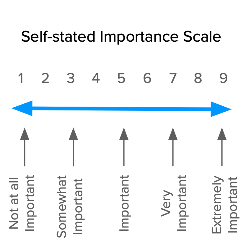
The self-stated importance question may be asked in the following format: “How important is it or would it be if: <requirement>?”. For example, “How important is it or would it be if: exporting videos always takes less than 10 seconds?”.
Responses should be in the form of a scale from 1 to 9, going from Not at all important to Extremely important.
 ImportanceScale
Test your questionnaire
If possible, test the questionnaire with some of your team members, before presenting it to your customers. If there’s any internal confusion about it, there will certainly be when talking with people from the outside.
Step 3: Analyze the Results
We now get to the step that motivated our study. After tabulating and processing our results we should be able to categorize our features and get insights into the best way to prioritize them.
There are two levels of analysis we can go into: discrete and continuous. These terms are just something I came up with due to lack of any standard (or better) ones for these methods. Both are references to mathematical concepts and relate to how they map participants’ responses to the Kano categories.
Each approach is useful, depending on the type of insights you’re looking for.
Discrete Analysis
The simplest way we can work through the Kano results is to:
- Divide respondents by the demographic / persona criteria that defines them;
- Categorize each respondent’s answers using the Evaluation table;
- Tally the total responses in each category for each feature (and demographic);
- Each feature’s category will be the most frequent response (i.e., the mode);
- In case of close results between categories, use the following rule (leftmost wins): Must-be > Performance > Attractive > Indifferent;
- If you’ve asked respondents for a self-stated importance ranking (and you should), average that for each feature.
You’ll end up with a table like this one:
 FreqResultsTable
If you’re seeing multiple results without a clear category, there may hidden customer profiles that you’re not considering. In this case you should probably go back to the customer responses to look for patterns; try checking which customers’ answers are usually the same as other customers’, to find “demographic clusters” you may be missing.
From the results table, you can rank features according to their importance. After that, the general rule of thumb to use when prioritizing is to go after all Must-be features, then add as much Performance ones as you can and finally include a few Attractive ones.
This type of analysis is great to give you a first level of understanding and it’s useful in many contexts where you don’t need a more rigorous approach (e.g., testing design ideas or making a rough draft of your roadmap.)
Continuous Analysis
Although the discrete analysis is great to get us started and give us an overall sense of the results, it has several issues. Namely:
- We lose a lot of information along the way. First, from 25 answer combinations for each respondent to one of six categories. Then, all respondent’s answers get further reduced into a single category for each feature;
- We don’t have any sense of the variance in our data;
- Softer answers get the same weight as harder ones. Just think about an Attractive with a dysfunctional “expect it” vs “live with”.
Bill DuMouchel[[7]](file:///var/folders/s3/_zj6yz353g5862dtcsdxhzn80000gn/T/com.soulmen.ulysses3/94afabefd77544e48a909f77fa1b393d/The%20Complete%20Guide%20to%20the%20Kano%20Model/index.html#fn7) proposed an excellent continuous analysis methodology, explained over the next few sections. Don’t worry about having to do these calculations yourself, though; the spreadsheet that comes along with this guide already does all of them for you(click here to get it). For now, just focus on understanding each step.
Scoring Answers
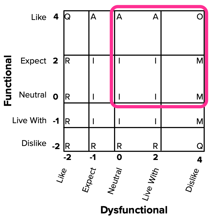
First, each answer option is translated to a numerical value within a satisfaction potential scale, going from -2 to 4. The bigger the number, the more an answer reflects how much the customer wants the feature. Importance is also scored from 1 to 9, as before.
- Functional: -2 (Dislike), -1 (Live with), 0 (Neutral), 2 (Must-be), 4 (Like);
- Dysfunctional: -2 (Like), -1 (Must be), 0 (Neutral), 2 (Live with), 4 (Dislike);
- Importance: 1 (Not at all Important), …, 9 (Extremely Important.)
You may be thinking that the Dysfunctional scale seems backwards. It’s not. Higher (positive) scores mean larger satisfaction potential. In the case of Dysfunctional answers, Disliking something means there’s strong disagreement with the feature’s absence. Thus, there would be more satisfaction potential if it were included and that’s why it has a bigger score.
The reason for this asymmetrical scale (starting from -2 instead of -4) is that the categories you get from answers on the negative end (Reverse and Questionable) are weaker than what you get on the positive end (Must-be and Performance). Thus, DuMouchel decided to emphasize that side of the scale.
These scores will then lead to the categorization of our features within a two-dimensional plane. With this method, there’s no need for the standard evaluation table anymore.
 2DCategorization
Our focus should be on the positive quadrant, which holds the strongest responses. Outside of it, we find weaker answers as well as Questionable and Reverse categorizations. If a feature ends up as Reverse, you can always use the trick of defining it as the opposite and switching the Functional and Dysfunctional scores, so it gets classified into another Kano category; you can also drop it from your study.
**A SIDENOTE: SATISFACTION AND DISSATISFACTION COEFFICIENTS **
If you dig around for Kano resources, you’ll probably find references to Satisfaction and Dissatisfaction coefficients. With the DuMouchel methodology we’re describing here, we have a better alternative to these. But given how often they’re referenced, they at least warrant a brief introduction.
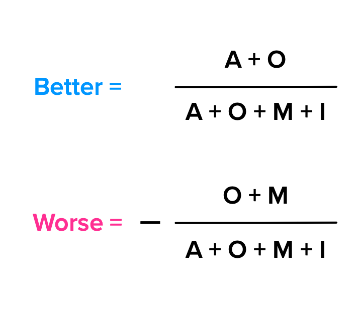
Mike Timko proposed using “Better” and “Worse” scores that reflected, in numerical terms, how customers’ satisfaction or dissatisfaction would change by the presence/absence of a feature[8](file:///var/folders/s3/_zj6yz353g5862dtcsdxhzn80000gn/T/com.soulmen.ulysses3/94afabefd77544e48a909f77fa1b393d/The%20Complete%20Guide%20to%20the%20Kano%20Model/index.html#fn8)
. Although he doesn’t call them Satisfaction and Dissatisfaction Coefficients in the original paper, that’s their commonly known name. By considering the total number of answers in each category for a given feature, they’re calculated using these formulas:
 CoefficientFormulas
Although they do produce a numerical result and are useful for relative comparisons, these coefficients have multiple issues that Timko himself referred in his article. The main thing is that it suffers from the same problem that discrete analysis has: these numbers come from using a single Kano category from each answer. This loss of information leads to higher variance in the data and equal weighting of all answers, independently of how strong or weak they are.
The Functional and Dysfunctional scores we’re calculating with DuMuchel’s method serve the same purpose without these issues, and that’s why we’re focusing on them here.
Categorizing Features
If we have numbers for each possible answer, that means we can work with averages. Here’s what we need to calculate for each feature:
- The average Functional, Dysfunctional and Importance values over all answers;
- The standard deviation for the Functional, Dysfunctional and Importance scores.
Taking each feature’s Functional and Dysfunctional scores, we can place them on the categorization plane like this:
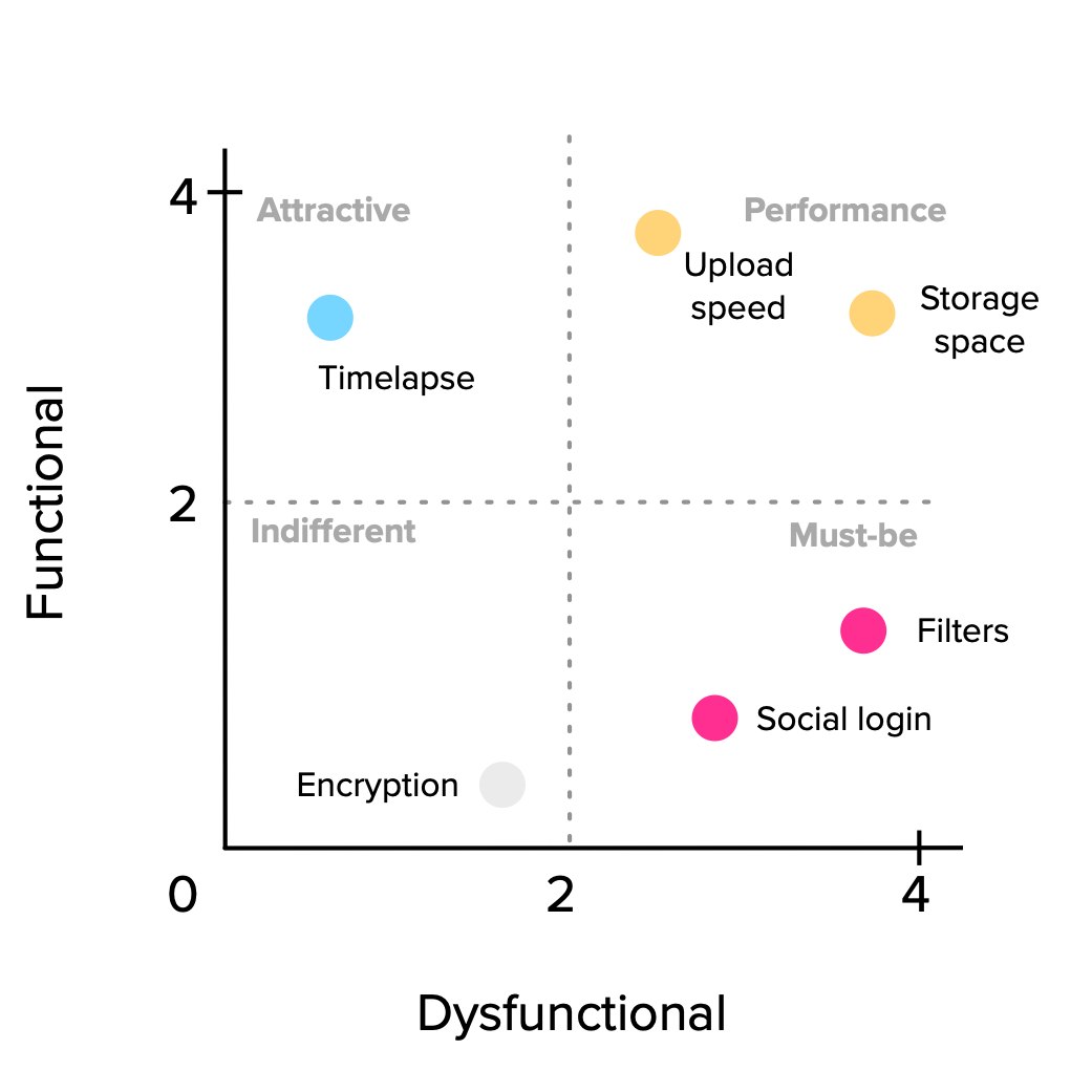 FeaturePlot
We’re of course talking about averages and what they hide is the possibly large variations in our data. That’s why it’s useful to add the standard deviation to our graphic in the form of error bars, so we have a notion of how on or off target our categorizations are. Something like this:
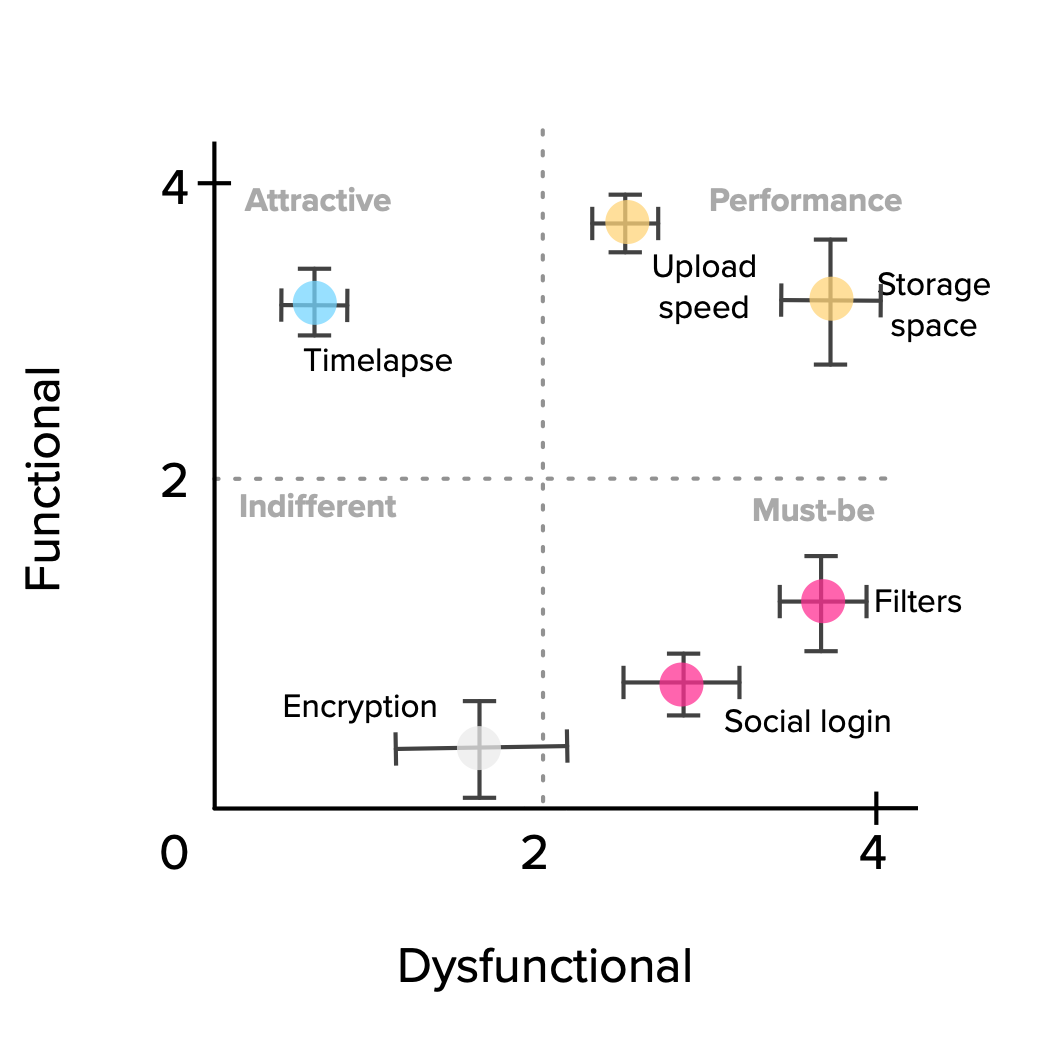 FeaturePlotWithError
The final layer to add is the Importance score. We can visualize this additional dimension by converting the scatter plot dots into bubbles, with sizes proportional to their importance. In this way, we can easily compare among features with similar positioning.
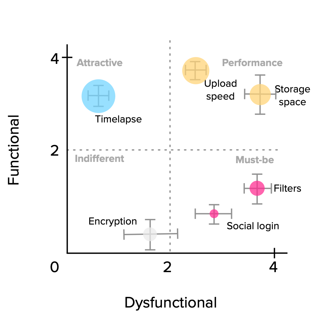 FeaturePlotWithErrorImportance
The general prioritization rule of thumb presented in the discrete analysis section still holds: Must-be > Performance > Attractive > Indifferent. This translates very well to graphical terms:
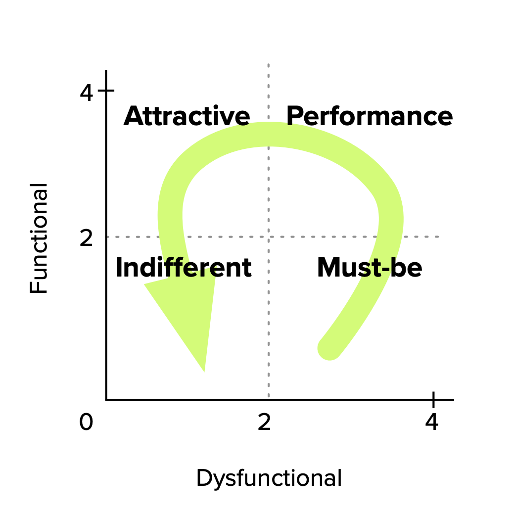 FeaturePlotPrioritization
For small feature sets, another (and probably better) way to visualize this is through a stack ranked list[[9]](file:///var/folders/s3/_zj6yz353g5862dtcsdxhzn80000gn/T/com.soulmen.ulysses3/94afabefd77544e48a909f77fa1b393d/The%20Complete%20Guide%20to%20the%20Kano%20Model/index.html#fn9). It uses three columns to rank features, in this order (from higher to lower scores): potential for dissatisfaction, potential for satisfaction and importance. In our case, the first two columns are the Dysfunctional and Functional scores, respectively. Here’s how it looks:
 ContResultsTable
Notice the last two rows. What would you do in that situation? You have a feature that it’s an Indifferent (but actually quite near Must-be,) with a larger impact on dissatisfaction than another. The other one would greatly increase satisfaction and it’s deemed to be really important by customers. There are cases to be made for prioritizing one before the other. As you can see, just following some ranking order doesn’t solve every dilemma for us; we still need to make tough calls, experiment, measure and iterate if necessary.
Get started today: an approach (and toolset) to launch your own Kano study
That’s it. You’ve made it this far and you have now learned about every important aspect of the Kano model. Now it’s time to actually use it in practice.
I realize it’s not immediately clear how to take all this knowledge and make it work for you. But you can. Even today if you want to.
In this section we’ll go over a practical approach and set of tools you can use to conduct your very own Kano analysis. Let’s go back to the 3 step process that was introduced in the second section of this guide.
Step 1: Choose your target features and users
You’re probably working on some new features and ideas for your next product release. If you aren’t, you should follow along anyways, even though you might not apply this right now.
Out of the features/ideas you’re working on:
- Which ones are you struggling to prioritize?
- Which ones have direct impact for your customers?
- Pick 3, at most (you can always do larger studies later, after getting comfortable with all of this.)
Which demographics (or personas) are these features targeting? Pick 15 customers (or more) per each demographic. If you’re using Intercom or Mixpanel, it will be very easy to select a subset of your customers within your target.
Step 2: Get the (best possible) data from your customers
There are two parts to this step:
- Defining the questions to ask our customers (or prospects);
- Creating and distributing the survey to gather responses.
Defining the questions
There are two types of questions you can present in your survey: interaction-based and text-based.
Interaction-based
If you work on a Software product, you probably have wireframes or mockups for your ideas and feature specifications. If you do, you already have the best possible “question” to present to your respondents.
What you need is to** make those wireframes or mockups interactive** (if they aren’t already).
Using a tool like Balsamiq or InVision, link your wireframes together so they’re interactive. This will make the feature come alive for the user and help overcome any problems in your question’s wording.
Text-based
If you don’t have any available wireframes or mockups, you can still use the traditional text-based questions. You should however be extra careful in creating a question that is clear and effective. Go back to that section if you need to refresh that topic.
Creating and distributing the survey
Now of course you need to create a survey to capture responses. There are some things to consider:
- Add a very short explanation of the survey’s goal, answer format and what respondents need to do;
- If you’re using an interactive wireframe, you should very briefly describe the goal of the feature, provide a link to the wireframes and ask the user to come back to the survey[10](file:///var/folders/s3/_zj6yz353g5862dtcsdxhzn80000gn/T/com.soulmen.ulysses3/94afabefd77544e48a909f77fa1b393d/The%20Complete%20Guide%20to%20the%20Kano%20Model/index.html#fn10);
- You should capture a customer identifier in your survey (like their email), so you can later know which users have responded and the demographics/persona to which they belong.
You can create a Google Form with an email field pre-filled by using an URL parameter[[11]](file:///var/folders/s3/_zj6yz353g5862dtcsdxhzn80000gn/T/com.soulmen.ulysses3/94afabefd77544e48a909f77fa1b393d/The%20Complete%20Guide%20to%20the%20Kano%20Model/index.html#fn11). If you send your users something like this, you’ll get identified responses without them having to input their email address (or some other identifier you may need on your end).
Step 3: Analyze the Results
After gathering enough responses, you can now proceed to the analysis step.
Along with this guide you also get an Excel spreadsheet that will jumpstart your analysis (click here to download it). It does the following for you:
- From each response (functional, dysfunctional and importance), calculates the discrete category, functional and dysfunctional scores;
- Calculates each feature’s discrete and continuous Kano categorization;
- Automatically stack ranks features based on potential dissatisfaction, satisfaction and importance;
- Draws a scatter plot graph that shows each feature’s positioning, relative importance as well as data variance through error bars.
You only need to copy & paste your survey results into the spreadsheet and add some details about your data (features and users).
You will get a Kano-based suggested prioritization in no time. From this, you can easily play with the data, make some pivot tables and start drilling into the details.
Final thoughts
There are no silver bullets when it comes to prioritizing our product’s features. Although we have to consider many different dimensions, customer satisfaction is probably the most important one. This led us to the questions from which we started out:
- How do we measure satisfaction?
- How do we choose what to build in order to provide it?
- How do we go beyond satisfaction and into delight?
These questions don’t have definitive answers (if they ever do, we all need to look for another job)[[12]](file:///var/folders/s3/_zj6yz353g5862dtcsdxhzn80000gn/T/com.soulmen.ulysses3/94afabefd77544e48a909f77fa1b393d/The%20Complete%20Guide%20to%20the%20Kano%20Model/index.html#fn12).
What this guide has hopefully given you is another tool to add to your arsenal for making kick-ass products: the Kano model. You’ve learned about what it is, how to use it and how to get started, today.
Try it out. Adapt it. Make it your own. Drive your product towards delight and [let me know how it goes].
- Noriaki Kano et al., “Attractive Quality and Must-be Quality,” research summary of a presentation given at Nippon QC Gakka: 12th Annual Meeting (1982), January 18, 1984 [↩](file:///var/folders/s3/_zj6yz353g5862dtcsdxhzn80000gn/T/com.soulmen.ulysses3/94afabefd77544e48a909f77fa1b393d/The%20Complete%20Guide%20to%20the%20Kano%20Model/index.html#ffn1)
- Pouliot, Fred, “Theoretical Issues of Kano’s Methods” on “Kano’s Methods for Understanding Customer-defined Quality”, Center for Quality of Management Journal, Fall 1993 [↩](file:///var/folders/s3/_zj6yz353g5862dtcsdxhzn80000gn/T/com.soulmen.ulysses3/94afabefd77544e48a909f77fa1b393d/The%20Complete%20Guide%20to%20the%20Kano%20Model/index.html#ffn2)
- Diane Shen, “Developing and Administering Kano Questionnaires” on “Kano’s Methods for Understanding Customer-defined Quality”, Center for Quality of Management Journal, Fall 1993 [↩](file:///var/folders/s3/_zj6yz353g5862dtcsdxhzn80000gn/T/com.soulmen.ulysses3/94afabefd77544e48a909f77fa1b393d/The%20Complete%20Guide%20to%20the%20Kano%20Model/index.html#ffn3)
- Jan Moorman, “Measuring User Delight using the Kano Methodology,” https://vimeo.com/62646585, Interaction13 conference, Toronto, January 2013 [↩](file:///var/folders/s3/_zj6yz353g5862dtcsdxhzn80000gn/T/com.soulmen.ulysses3/94afabefd77544e48a909f77fa1b393d/The%20Complete%20Guide%20to%20the%20Kano%20Model/index.html#ffn4)
- Gary Burchill, “Observation of the Use of Kano’s Method” on “Kano’s Methods for Understanding Customer-defined Quality”, Center for Quality of Management Journal, Fall 1993 [↩](file:///var/folders/s3/_zj6yz353g5862dtcsdxhzn80000gn/T/com.soulmen.ulysses3/94afabefd77544e48a909f77fa1b393d/The%20Complete%20Guide%20to%20the%20Kano%20Model/index.html#ffn5)
- Robert Blauth, Reinhart Richter and Allan Rubinoff, “Experience in the Use of Kano’s Methods in the Specification of BBN RS/1 Release 5.0” on “Kano’s Methods for Understanding Customer-defined Quality”, Center for Quality of Management Journal, Fall 1993 [↩](file:///var/folders/s3/_zj6yz353g5862dtcsdxhzn80000gn/T/com.soulmen.ulysses3/94afabefd77544e48a909f77fa1b393d/The%20Complete%20Guide%20to%20the%20Kano%20Model/index.html#ffn6)
- William DuMouchel, “Thoughts on Graphical and Continuous Analysis” on “Kano’s Methods for Understanding Customer-defined Quality”, Center for Quality of Management Journal, Fall 1993 [↩](file:///var/folders/s3/_zj6yz353g5862dtcsdxhzn80000gn/T/com.soulmen.ulysses3/94afabefd77544e48a909f77fa1b393d/The%20Complete%20Guide%20to%20the%20Kano%20Model/index.html#ffn7)
- Mike Timko, “An Experiment in Continuous Analysis” on “Kano’s Methods for Understanding Customer-defined Quality”, Center for Quality of Management Journal, Fall 1993 [↩](file:///var/folders/s3/_zj6yz353g5862dtcsdxhzn80000gn/T/com.soulmen.ulysses3/94afabefd77544e48a909f77fa1b393d/The%20Complete%20Guide%20to%20the%20Kano%20Model/index.html#ffn8)
- You can also check out UX Clinic’s case study with both stack ranked and scatter plot visualizations [↩](file:///var/folders/s3/_zj6yz353g5862dtcsdxhzn80000gn/T/com.soulmen.ulysses3/94afabefd77544e48a909f77fa1b393d/The%20Complete%20Guide%20to%20the%20Kano%20Model/index.html#ffn9)
- You also add a special note in the end of your interactive wireframe, asking users to close that tab and go back to the survey [↩](file:///var/folders/s3/_zj6yz353g5862dtcsdxhzn80000gn/T/com.soulmen.ulysses3/94afabefd77544e48a909f77fa1b393d/The%20Complete%20Guide%20to%20the%20Kano%20Model/index.html#ffn10)
- Get the base URL to send out by using this tip and then change the email field for each customer. [↩](file:///var/folders/s3/_zj6yz353g5862dtcsdxhzn80000gn/T/com.soulmen.ulysses3/94afabefd77544e48a909f77fa1b393d/The%20Complete%20Guide%20to%20the%20Kano%20Model/index.html#ffn11)
- Check out this fascinating presentation by Jared Spool on the depth of getting to delight [↩](file:///var/folders/s3/_zj6yz353g5862dtcsdxhzn80000gn/T/com.soulmen.ulysses3/94afabefd77544e48a909f77fa1b393d/The%20Complete%20Guide%20to%20the%20Kano%20Model/index.html#ffn12)


